Change.org – Making petition publishing easy and accessible
Change.org – Making petition publishing easy and accessible
Change.org had a top-level company goal of increasing quality petitions and petition victories and through user interviews, we'd uncovered a lot of exciting opportunities to go after – tailored petition advice, petition templates, a better decision-maker tool, setting a custom signature goal, onboarding, and making substantial improvements to our overall UX, improving liminal spaces between key moments.
The problem was that we were blocked from pursuing these opportunities by our petition creation flow was over 6 years old and both the design and code base were extremely difficult to make changes to.
In order to gather more and recent feedback specific to the petition creation flow, I added a customer satisfaction (CSAT) poll via HotJar to our flow. This captured feedback from anyone interacting with the petition creation flow, whether they published or not. In addition to capturing qualitative comments and feedback that I could then synthesize into opportunities, it also allowed me to establish a baseline CSAT score to measure against in the future (our beginning CSAT was 63.5%).
In addition, my product team worked together in order to send a survey to folks who visited our petition flow, but did not publish a petition. Both the survey and the CSAT poll were also set up to help us schedule some of these users for interviews. Finally, I also performed a heuristic assessment of the flow and audited our design system for accessibility and WCAG compliance.

The old petition creation flow – the numbered navigation, sign in flow, and haphazard overall UX all needed a fix
Taking into account our business goals and engineering needs, and after synthesizing and validating my findings from my research and heuristic assessment, I identified a number of opportunities for our team to address. Here's what I found:

I shared the early findings with our stakeholders, and our team moved forward to story mapping, solution exploration, and assessment. First, we aligned on the priority of user stories and roughly planned our first few releases. Then I set out to explore possible solutions and asked my teammates to do a bit of the same. Finally, we reconvened to share, discuss, and score the different solution ideas against our criteria.
We aligned on using a single question and answer flow for a few reasons: it's optimal for mobile and it was easy to experiment with and customize. We could easily shuffle, fork, and rearrange questions, which would allow us to offer dynamic, custom campaign guidance and recommendations.
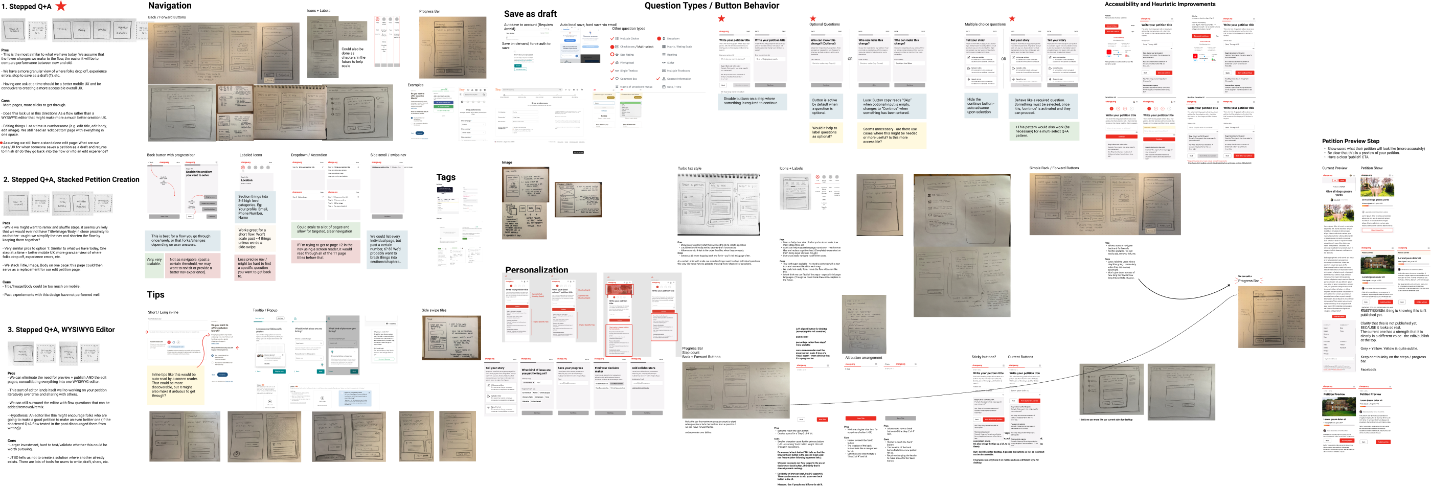
Some of the process notes, wireframes, and competitive analysis from this work. Redesigning the petition creation flow was a substantial project! Want to see more? Let's talk!
In the end, we created a completely modular petition creation flow. In the new design and code base, pages could easily be added, removed, forked, and even dynamically rearranged.
Our sign in flow was overhauled and the UX debt around login and password reset was resolved. In the new flow, we intelligently routed users through sign in flow and automatically sent authentication emails where required. This, as well as other efforts helped us to realize a 32% reduction in errors that block publishing.
We also saw a 39.4% increase in petitions published (or a little over 3,000 petitions every week!) as well as an additional $100k in weekly revenue, a 100% increase to optional phone number opt-ins, and last but not least – our CSAT soared from 63.5% to 90% 📈
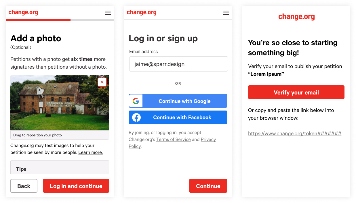
Checkout the final designs and highlights from the work below!

Buttons were made more tappable and legible, forms were updated to WCAG standard and included clear labels, error messages, and screen reader functionality that was not present previously.
Social authentication buttons were brought up to brand parity and built using the Google and Facebook APIs in order to provide additional security benefits to our users as well as future-proof the flow by proactively meeting a future compliance requirement.

The phone number collection experience was totally redesigned from a generic input field that accepted all kinds of bad data, to a beautiful, auto-formatting, error-preventing input that could automatically validate numbers.
We also better explained the value of the free campaigning service, and offered custom, localized content. As a result, we saw a 100% increase to optional phone number opt ins.

Unnecessary errors were avoided by changing the button behavior, and when an error was triggered, we delivered that feedback immediately and provided users with a clear route to resolution.
In the new log in flow, we detected whether the email address the starter provided was a new user or a returning user, and whether that returning user had set their own password.
This allowed us to automatically trigger a verification email to help these folks set a password and get back to publishing their petition.

The new flow was performant, accessible, and not only modular at a high level, but had been designed modularly at a page level.
Various input types had been accounted for in the design system, and commonly requested features were already mocked up at a mid-fidelity level as an additional hand-off present to the new growth team who would be taking over this surface area.